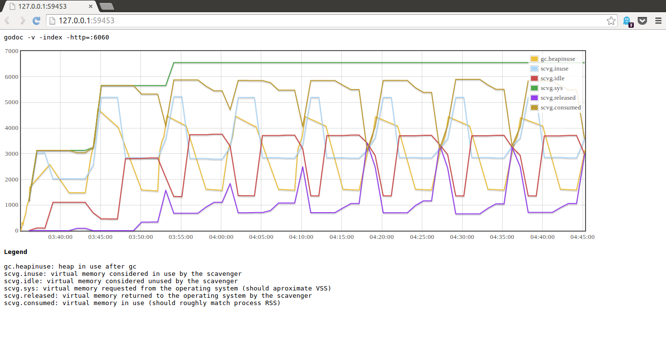
Juju is a pretty large project. Some of our core packages have large complex dependency graphs and this is undesirable because the packages which import those core packages inherit these dependencies raising the spectre of an inadvertent import loop.
Reducing the coupling between our core packages has been a side project for some time for me. I’ve written several tools to try to help with this, including a recapitulation of the venerable graphviz wrapper.
However none of these tools were particularly useful, in fact the graphical tools I wrote became unworkable visually well before their textual counterparts — at least you can grep the output of go list to verify if a package is part of the import set of not.
Visualising the import graph
I’d long had a tab in my browser open reminding me to find an excuse to play with d3. After a few false starts I came up with tool that took a package import path and produced a graph of the imports.
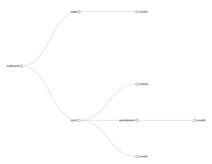
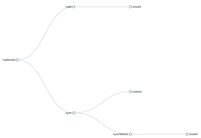
math/rand tree graph
In this simple example showing math/rand importing its set of five packages, the problem with my naive approach is readily apparent — unsafe is present three times.
This repetition is both correct, each time unsafe is mentioned it is because its parent package directly imports it, and incorrect as unsafe does not appear three times in the final binary.
After sharing some samples on twitter, rf and Russ Cox suggested that if an import was mentioned at several levels of the tree it could be pushed down to the lowest limb without significant loss of information. This is what the same graph looks like with a simple attempt to implement this push down logic.
math/rand pushdown tree
This approach, or at least my implementation of it, was successful in removing some duplication. You can see that the import of unsafe by sync has been pruned as sync imports sync/atomic which in turn imports unsafe.
However, there remains the second occurrence of unsafe rooted in an unrelated part of the tree which has not been eliminated. Still, it was better than the original method, so I kept it and moved on to graphing more complex trees.
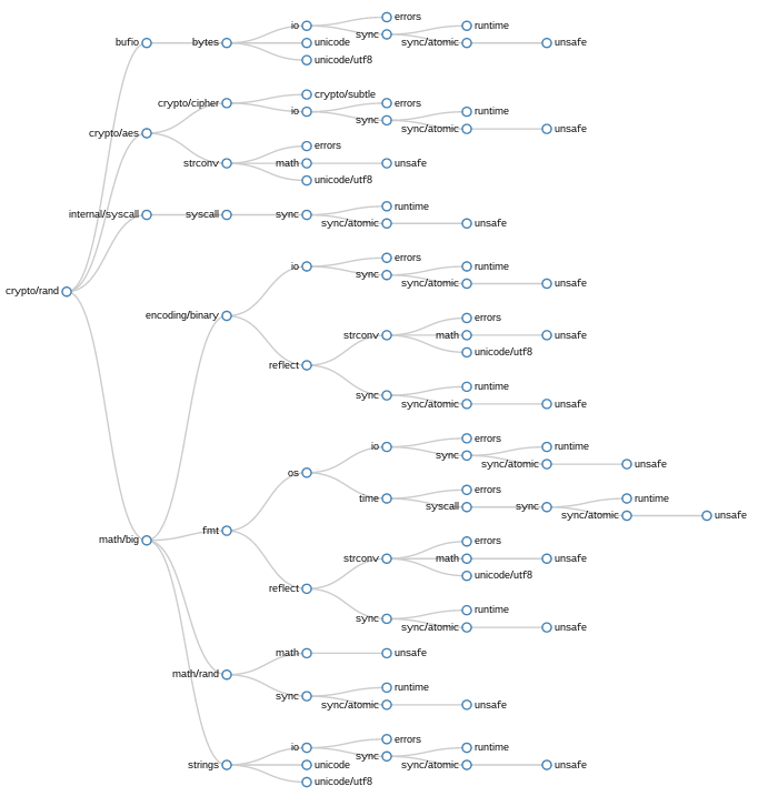
crypto/rand pushdown tree
In this example, crypto/rand, though the pushdown transformation has been applied, the number of duplicated imports is overwhelming. What I realised looking at this graph was even though pushdown was pruning single limbs, there are entire forks of the import graph repeated many times. The clusters starting at sync, or io are heavily duplicated.
While it might be possible to enhance pushdown to prune duplicated branches of imports, I decided to abandon this method because this aggressive pruning would ultimately reduce the import grpah to a trunk with individual imports jutting out as singular limbs.
While an interested idea, I felt that it would obscure the information I needed to unclutter the Juju dependency hierarchy.
However, before moving on I wanted to show an example of a radial visualisation which I played with briefly
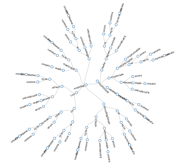
crypto/rand radial graph
Force graphs
Although I had known intuitively that the set of imports of a package are not strictly a tree, it wasn’t clear to me until I started to visualise them what this meant. In practice, the set of imports of a package will fan out, then converge onto a small set of root packages in the standard library. A tree was the wrong method for visualising this.
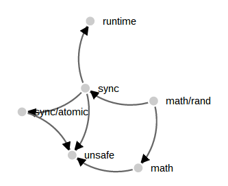
math/rand force graph
While perusing the d3 examples I came across another visualisation which I felt would be useful to apply, the force directed graph. Technical this is a directed acyclic graph, but the visualisation applies a repulsion algorithm that forces nodes in the graph to move away from each other, hopefully forming a useful display. Here is a small example using the math/rand package
Comparing this to the tree examples above the force graph has dealt with the convergence on the unsafe package well. All three imports paths are faithfully represented without pruning.
But, when applied to larger examples, the results are less informative.

crypto/rand force graph
I’m pretty sure that part of the issue with this visualisation is my lack of ability with d3. With that said, after playing with this approach for a while it was clear to me that the force graph is not the right tool for complex import graphs.
Compared to this example, applying force graph techniques to Go import graphs is unsuccessful because the heavily connected core packages gravitate towards the center of the graph, rather than the edge.
Chord graphs
The third type I investigated is called a chord graph, or at least that is what it is called in the d3 examples. The chord graph focuses on the interrelationship between nodes, rather than the node itself, and has proved to be best, or at least most appealing way, of visualising dependencies so far.
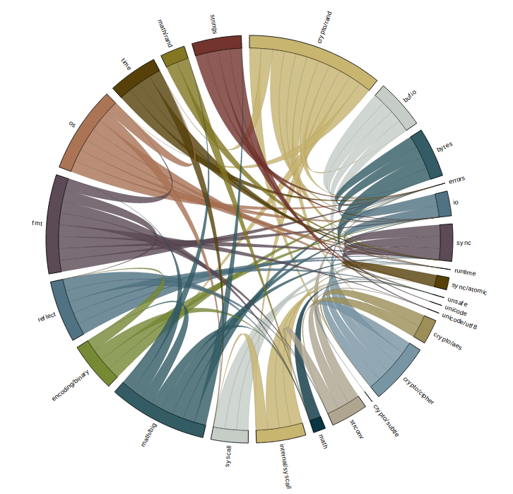
crypto/rand chord graph
While initially overwhelming, the chord graph is aided by d3’s ability to disable rendering of part of the graph as you mouse over them. In addition the edges have tool tips for each limb.
crypto/rand chord graph highlighting bufio
In this image i’ve highlighted bufio. All the packages that bufio imports directly are indicated by lines of the same color leading away from bufio. Likewise the packages that import bufio directly are highlighted, in different color and in a different direction, in this example there is only one, crypto/rand itself.
The size of the segments around the circumference of the circle is somewhat arbitrary, indicating the number of packages that each directly import.
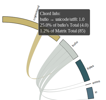
For some packages in the standard library, their import graph is small enough to be interpreted directly. Here is an shot of fmt which shows all the packages that are needed to provide fmt.Println("Hello world!").
fmt chord graph
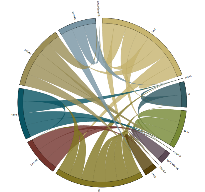
Application to large projects
In the examples I’ve shown so far I’ve been careful to always show small packages from the standard library, and this is for a good reason. This is best explained with the following image
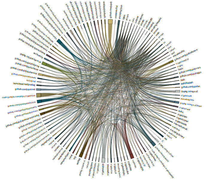
github.com/juju/juju/state chord graph
This is a graph of the code that I spend most of my time in, the data model of Juju.
I’m hesitant to say that chord graphs work at this size, although it is more successful than the tree or force graph attempts. If you are patient, and have a large enough screen, you can use the chord graph method to trace from any package on the circumference to discover how it relates to the package at the root of the graph.
What did I discover ?
I think I’ve made some pretty pictures, but it’s not clear that chord graphs can replace the shell scripts I’ve been using up until this point. As I am neither a graph theorist, nor a visual designer, this isn’t much of a surprise to me.
Next steps
The code is available in the usual place, but at this stage I don’t intend to release or support it; caveat emptor.
Alan Donovan’s work writing tools for semantic analysis of Go programs is fascinating and it would be interesting to graph the use of symbols from one package by another, or the call flow between packages.